Ben Zenker
Brand
Work involving the curation of digital and physical assets under a cohesive design.
Brand
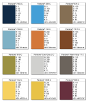
From Derby DashboardThe brand for this site started with its core membership: Sigma Chi Blue. From there, I gathered a bright palette from the Material family to convey energy and excitement to the information being displayed.
Consistent padding is used between the white content blocks, reminiscent of Facebook posts. This provides a separation between the background and the content, eliminating a potential overuse of box shadows.
The pink graph icon is used in the favicon, open graph image, and configurable manifested images such as when you save the website to your mobile homescreen. The icon, backed by Sigma Chi Blue, can be seen throughout launch video, on facebook, and on the GitHub repository.


Brand
From Broadcast Drone
This project offered many opportunities to compose a cohesive brand, given that we built a mobile app, designed a poster, produced a product video, and crafted a final slideshow presentation.
We chose an incredibly simple color palette and used flat design throughout the icons. The poster below brings together several materials that we designed throughout the project, which communicates the brand in a vivid way.
